Function asChild

The pitfalls of polymorphic components, and how I use a time-tested React design pattern to overcome them
Everything should be made as simple as possible, but not simpler. —Albert Einstein
As a design system engineer, my primary goal is to deliver a consistent user experience across a large number of products. Succeeding in this requires consistent reuse of the components I build. Consistent reuse of these components requires them to adapt to a wide range of use cases. Otherwise, my clients will opt out and roll their own components, typically losing important functionality or design details in the process.
My most essential technical tool for delivering the required flexibility is the notion of the polymorphic component. Before jumping into code, allow me to explain this important concept and why it's so useful.
What are polymorphic components?
A polymorphic component delivers consistent visual design and functionality in a context-sensitive manner as follows:
-
It offers direct control over the rendered markup, allowing developers to improve accessibility via semantic HTML.
-
Its appearance and/or behavior can be combined with those of another component.
A Button component is the canonical example of component polymorphism: By
default, it just renders a HTML <button> element with some fancy styling, but
it can be configured to render an <a> element instead (like when a screen
reader should announce it as a link).
Aside from custom HTML tags, a Button might be combined with e.g. a Link
component from a routing framework like
React Router or
Next.js—bringing
the visual design of Button and the functionality of Link together into a
single element.
In short, the flexible nature of polymorphic components allows a single implementation to serve a wider range of use cases. This promotes reuse of UI elements, improving code maintainability while delivering a more cohesive user experience.
Current approaches
Over the past few years, two approaches for achieving polymorphic components
have been widely circulated and discussed within the React community: the as
prop and the asChild prop. Before reinventing the wheel, let's take a look at
these.
The as prop
The as prop emerged starting around 2018 in popular libraries such as
Styled Components,
Material UI (under the
component prop name), and
Chakra UI. Using the as
prop, the button-as-link use case described above would be implemented something
like this:
<Button as="a" href="https://react.dev">
  Get started
</Button>
For TypeScript users, the as prop can be especially interesting because a
typical type definition will guard against invalid prop combinations depending
on the value of the as prop. For example, this would not compile since href
is not a valid HTML <button> attribute:
<Button as="button" href="https://react.dev">
  Get started
</Button>
A couple of years ago, the as prop was practically synonymous with the term
polymorphic component, and for good reason. It is widely recognized; it's easy
to use; and it offers a reasonable degree of type safety, which unfortunately is
not true of its "successor" (more on that later). But, to be fair, it's not a
perfect solution.
Problems with the as prop
Over the last two years, the as prop has been challenged as the de-facto
standard for polymorphic components on the following points:
- Slow TypeScript performance
- Poor type inference
- Prop collisions
To be honest, I haven't experienced the first two issues myself; but I can relate to the third issue, and it is significant.
Prop collisions
Consider two polymorphic components: Highlight, which contributes a
configurable background color to an element, and Outline, which similarly adds
a colored outline around an element.
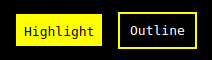
<>
  <Highlight color="yellow">Highlight</Highlight>
  <Outline color="yellow">Outline</Outline>
</>
You can combine the two using the as prop.
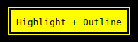
<Highlight as={Outline} color="yellow">
  Highlight + Outline
</Highlight>
But what if you want a two-tone effect?
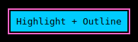
<Highlight as={Outline} color="hotpink" color="lightblue">
  Highlight + Outline
</Highlight>
Unfortunately, it isn't possible to achieve this on the basis of the Highlight
and Outline components because you can't control each component's color prop
independently. The duplicate color prop in the code example simply wouldn't
compile.
Now let's return for a moment to the monochromatic combination that actually works.
By default, this renders a generic <div> element. But what if you need to
render a <button> element instead?
<Highlight as={Outline} as="button" color="yellow">
  Highlight + Outline
</Highlight>
Once again, the duplicate as prop wouldn't compile, making it impossible to
combine the two components and control their rendered HTML at the same time.
In short, the prop collision issue presents two challenges:
-
If two components share a prop name, that prop can't be controlled independently for each component. (Technically, one of the props hides the other's interface—imagine if they have different types!)
-
Composition is limited to two components—unless you need a custom HTML tag, in which case composition isn't possible because the
asprop is already used for that purpose.
Final thoughts on the as prop
For the most part, the as prop has served me well; but I'm concerned about the
potential for clashing props to create defects much more insidious than the one
demonstrated above by the color prop. Moreover, I'm really not happy having to
choose between component composition and semantic markup. Finally, the ability
to compose three or more components together could prove interesting, enabling a
higher degree of reuse than the as prop currently allows.
The asChild prop
The asChild prop, popularized by
Radix, addresses
the issues of the as prop by allowing the component's child element to
determine how it is rendered. Using asChild, here is how the button-as-link
use case I introduced earlier would be implemented:
<Button asChild>
  <a href="https://react.dev">Get started</a>
</Button>
To the compiler, this just looks like a plain HTML <a> element nested as the
child of some <Button> element. This one weird trick should make the
TypeScript performance and type inference much more predictable.
And because <Button> and <a> are now separate elements, a given prop can be
set explicitly on either one; thus, prop collisions are eliminated.
Problem(s) solved, right?
Well, yes—but what about the problems created?
Problems with the asChild prop
Earlier, I showed that the as prop has one serious composability issue along
with some possible TypeScript-related inconveniences. On the other hand, the
asChild prop, promoted as the as prop successor, is not such an obvious
improvement when considering a few other aspects.
No contract between parent and child
A component implementing the asChild prop accepts any element as "child",
forwarding props without regard to whether that type of element is designed to
accept them. That means, when implementing the "child" component, you must
consider the private implementation details of the "parent" component—and hope
they don't change, since the TypeScript compiler can't guarantee compatibility.
To see the problem firsthand, check out this demo.
Invalid HTML
asChild's prop forwarding scheme can easily produce invalid markup. Look no
further than the button-as-link use case for evidence. Consider what happens
when you disable the button.
<Button asChild disabled>
  <a href="https://react.dev">Get started</a>
</Button>
The resulting HTML would look essentially like the following—with no TypeScript
error to alert you that the disabled prop
is not compatible
with an <a> element.
<a href="https://react.dev" disabled>Get started</a>
On the other hand, each of the following would result in a type error as expected.
<>
  <a href="https://react.dev" disabled>
    Get started
  </a>
  <Button as="a" href="https://react.dev" disabled>
    Get started
  </Button>
</>
To compare for yourself, have a look at this demo.
No control over prop forwarding
asChild assumes a straightforward 1-to-1 mapping between the props forwarded
from the "parent" and the props accepted by the "child". But, as the previous
example shows, that may be a bit too optimistic.
A reasonable implementation for a "disabled" <a> element might look something
like this:
<a
  href="https://react.dev"
  className="disabled"
  aria-disabled="true"
  onClick={e => {
    e.preventDefault();
  }}>
  Get started
</a>
In the button-as-link context, the disabled prop forwarded from the Button
"parent" would be reflected in three distinct "child" props: className,
aria-disabled, and onClick. Because asChild hides its prop forwarding
logic, it isn't possible to achieve this—instead, you'll be stuck with that
invalid disabled attribute in the resulting HTML, as discussed earlier.
Contraindicated use of cloneElement
The implementation of the asChild prop (Radix's
Slot component),
utilizes the cloneElement function. However, the
React documentation warns that
"using cloneElement is uncommon and can lead to fragile code" while "[making]
it hard to tell how the data flows through your app". It continues on to
recommend the render prop as a "more explicit" alternative
where "you can clearly trace" the props.
Final thoughts on the asChild prop
Over the years, I've used many technologies that initially appeared to make
things easier but eventually taught me that they were merely hiding complexity,
rather than eliminating it. Unfortunately, the asChild prop seems to fit that
profile.
It solves the problems of the as prop by pretending that one element is
actually two. The type checker has no knowledge of asChild's implicit magic
and is powerless to prevent the "parent" component from injecting any number of
props into the "child" element, whether compatible or not.
The side effects of this design might include tight coupling between "parent"
and "child" components, whose implementation details must line up without
compiler help; invalid HTML; and incomplete functionality, particularly in the
case of a "child" component whose code you don't control (e.g. a third-party
Link component). Moreover, the React docs warn that asChild's use of
cloneElement "makes it harder to trace the data flow".
To its credit, the asChild prop has raised awareness about some issues with
the as prop, and it has, technically, solved those issues. It has also
reminded us that the as prop isn't the only way to do polymorphic components.
Introducing Function asChild
After realizing the many pitfalls of the as and asChild props, I began the
search for a safer and more flexible approach to polymorphic components. I'm
happy to report that, rather than inventing something new, I discovered an
approach that builds upon an established React pattern dating back to at least
2016, a render prop
variant known as
Function as Child Component.
A quick preview
Before we dive into the implementation, I'd like to offer a glimpse of what
Function asChild looks like from a "client code" perspective. Let's return to
the polymorphic Button once again.
By default, the Button component provides the same interface as the HTML
button tag, enhanced with any additional props, e.g. a variant.
<Button type="submit" form="loginForm" variant="primary">
  Submit
</Button>
When you want to render a different type of element, you pass a render function as child.
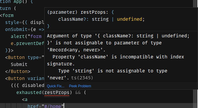
<Button variant="primary">
  {({ disabled, style, ...restProps }) =>
    exhausted(restProps) && (
      <a
        href="https://react.dev"
        aria-disabled={disabled}
        onClick={e => {
          disabled && e.stopPropagation();
        }}
        style={{
          ...style,
          ...(disabled ? { opacity: 0.5 } : undefined),
        }}>
        Get started
      </a>
    )
  }
</Button>
If you squint a little bit, you might recognize that this JSX structure actually
resembles its asChild "equivalent". However, since the child is a render
function rather than an element, this solution avoids implicit magic, doesn't
break the type checker, and produces valid HTML.
If you've seen render props before, you might have a pretty good idea of what's going on here. But it's easy to miss some essential details of this approach without walking through its implementation and usage. So, with that, let's get started.
Polymorphic component implementation
The first step is to define the interface between the Button component and the
render function. I usually refer to this as the forward props. For a simple
component whose scope is limited to visual styling, often this will consist of a
single style or className prop.
export type ButtonForwardProps = {
  className?: string;
};
Next, let's define the Button props. The union type forces the client code to
choose between the default HTML button tag interface and the Function asChild
interface. The variant prop is available in either case.
import { ComponentProps, ReactElement } from "react";
import { U } from "ts-toolbelt";

export type ButtonProps = U.Strict<
  (
    | ComponentProps<"button">
    | { children: (forwardProps: ForwardProps) => ReactElement }
  ) & {
    variant?: "primary" | "secondary";
  }
>;
After defining the prop types, the next step is to set up the Button as a
ref-forwarding function
component. The ref forwarding is useful for the default case of a HTML
<button>.
import { ComponentType, forwardRef } from "react";
import { O } from "ts-toolbelt";

export const Button = forwardRef<HTMLButtonElement, O.Omit<ButtonProps, "ref">>(
  function Button(
    { children, className = "", variant = "secondary", ...restProps },
    ref,
  ) {
    // TODO
  },
) as ComponentType<ButtonProps>;
The implementation begins with the forwardProps object, which will include a
dynamic className based on the incoming variant prop value.
Then, it checks whether children is a render function:
- If
childrenis indeed a render function, it calls that function and passes theforwardPropsas an argument. The result of the render function is then returned. - If
childrenis not a render function, that means it contains the content of the button. In this case, the implementation returns a<button>element. It spreads theforwardPropsfirst, followed by therestProps(any HTML button props that might have been provided). Finally, it ensures that therefandchildrenare forwarded properly.
import { ComponentType, forwardRef } from "react";
import { O } from "ts-toolbelt";

export const Button = forwardRef<HTMLButtonElement, O.Omit<ButtonProps, "ref">>(
  function Button(
    { children, className = "", variant = "secondary", ...restProps },
    ref,
  ) {
    const forwardProps: ButtonForwardProps = {
      className: `button button-${variant} ${className}`,
    };

    return typeof children === "function" ? (
      children(forwardProps)
    ) : (
      <button {...forwardProps} {...restProps} ref={ref}>
        {children}
      </button>
    );
  },
) as ComponentType<ButtonProps>;
That's all it takes to implement the polymorphic Button component!
Due to a quirk of TypeScript, however, how you use the component can make a significant difference in terms of type safety. So, to learn how to use it in the most effective way, read on.
Polymorphic component usage
At this point, we actually have a working polymorphic component. And here is how most people (myself included) would be inclined to use it:
<Button variant="primary">
  {props => (
    <a href="https://react.dev" {...props}>
      Get started
    </a>
  )}
</Button>
Unfortunately, TypeScript doesn't work as expected sometimes, and the prop spread is one such case. Due to a long-standing issue, excess props don't produce a compiler error.
You won't love the workaround, but hopefully you'll appreciate its effectiveness in preventing prop forwarding mistakes.
Avoiding the spread
When in doubt, the best way to cope with the prop spread's unsound nature is to avoid it entirely. That means fully destructuring the props and forwarding them individually.
<Button variant="primary">
  {({ className }) => (
    <a href="https://react.dev" className={className}>
      Get started
    </a>
  )}
</Button>
But even this has its pitfalls:
-
Forgotten props: It's easy to forget to destructure some of the props. Even if you account for all of them initially, additional props could be added to the
ButtonForwardPropsinterface in the future. -
Unused props: Similarly, it's easy to forget to actually forward some of the props, even if you remembered to destructure them.
Fortunately, each of these problems has a solution.
Exhaustiveness check
Let's make a a small change by adding ...restProps to the prop-destructuring
expression.
<Button variant="primary">
  {({ className, ...restProps }) => (
    <a href="https://react.dev" className={className}>
      Get started
    </a>
  )}
</Button>
If you've destructured all of the props as intended, restProps will be an
empty object, i.e. {}. You can assert this with the exhausted function,
which produces a TypeScript error when called with a non-empty object.
<Button variant="primary">
  {({ className, ...restProps }) => exhausted(restProps) && (
    <a href="https://react.dev" className={className}>
      Get started
    </a>
  ))}
</Button>

// Keep this somewhere like a `util.ts` module.
function exhausted(x: Record<any, never>) {
  return true as const;
}
For example, here's what happens if you forget about the className prop:
As I mentioned earlier, it's still possible to destructure a prop and forget to forward it. Next, I'll show you an additional measure to prevent this common mistake.
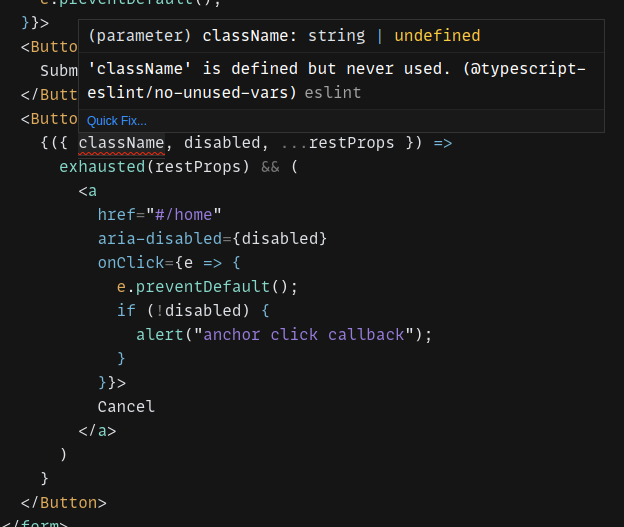
Unused prop check
In general, all of the props passed to a render function should actually be used
in some way; otherwise, aspects of the component's appearance or behavior might
be lost. Since the exhausted function already guarantees that the props object
is fully destructured, all that's left is to ensure that none of these props are
unused.
For this, I simply recommend the ESLint rule
@typescript-eslint/no-unused-vars.
With this rule enabled, here's what happens if you forget to forward the
className prop:
If you aren't already using ESLint, see typescript-eslint's Getting Started guide for more information on how to configure your project.
Interactive demos
I invite you to experience Function asChild through a couple of code demos I've prepared:
Reviewing the solution
Now that you've seen how to implement and use the Function asChild approach for polymorphic components, let's consider its relative advantages:
-
Predictable TypeScript performance and type inference
-
Prop collision avoidance
-
High degree of type safety
-
Transparent prop forwarding scheme that you control
-
Valid HTML output
-
Ability to compose three or more components
-
Loose coupling between components
Compared to the as and asChild props, Function asChild offers a more
flexible and far safer approach to polymorphic components.
Wrapping up
Polymorphic components are extremely useful and, unfortunately, more complicated
than I once realized. The as and asChild props, each in their own way, try
to make polymorphic components simpler than they actually are, and this is where
their problems begin.
On the other hand, Function asChild hides nothing from you. It prioritizes thoroughness and precision; while hopefully becoming more convenient in the future as the TypeScript team improves type checking for prop spreads.
For now, selecting the right approach comes down to "convenience" versus correctness. If you've made it this far, I know you'll choose wisely.
Stay informed
Subscribe to email updates and be the first to know when I post new content.
I hate spam as much as you do.
Unsubscribe at any time — no hard feelings!